Larostale, a pioneer in redefining coliving for single-parent families, offers an innovative solution with affordable and adaptable housing.
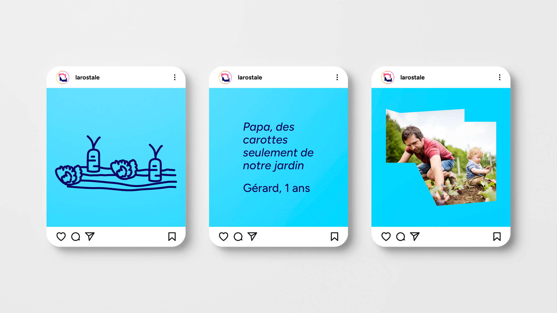
Affordable, adaptable and high-quality coliving, without losing services, for single-parent families. Our coliving is designed to reduce parents’ daily stress and improve their children’s lives. We seek to find a balance between shared spaces (so that children can interact with other children and parents with others in the same situation) and private spaces.
Balance is defined as the state in which different elements are in harmony and function effectively and harmoniously.
At Larostale, we identify two fundamental moments of balance that form the foundation of our brand concept:
Balance between private and shared spaces.
Balance between affordability and quality, thanks to the flexibility offered by Larostale with its three types of services.
For the creation of the logo, we based our design on the concept of balance—how different elements coexist efficiently and harmoniously, in this case, within the same space.
To achieve this, we started with the nine letters of the name and created two nine-sided polygons, each representing the different spaces (private and shared) found in a Larostale coliving. When these two spaces are in balance, they coexist effectively and harmoniously, forming another nine-sided space.
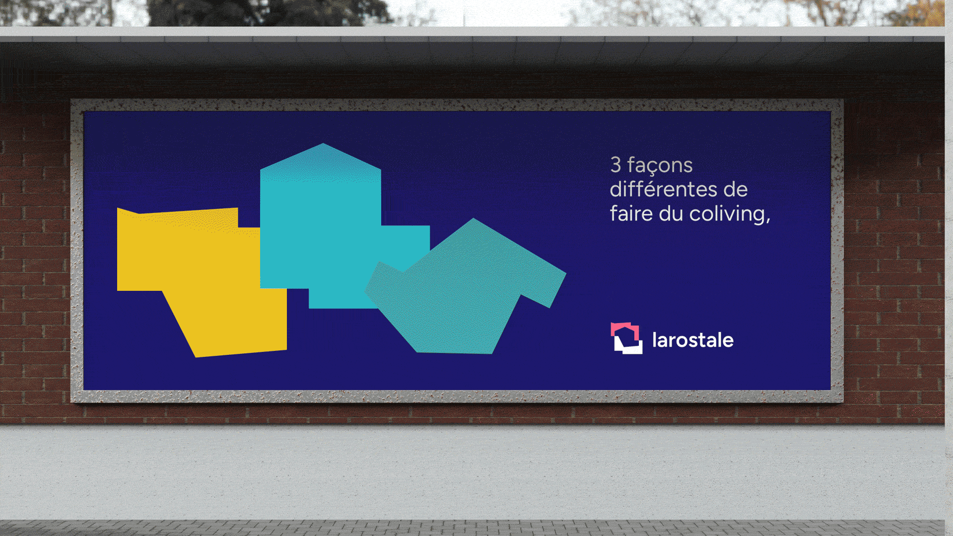
These three created spaces represent the three blocks that Larostale offers, reinforcing the concept of a flexible brand
To reinforce the brand’s flexibility concept, each space that forms the isotype can transform into anot her space. This way, we add extra value to the brand when creating visuals, allowing us to adapt to any type of format.