Kiiro was born with the idea of providing the best AWS solution, taking into account the needs and characteristics of each company.
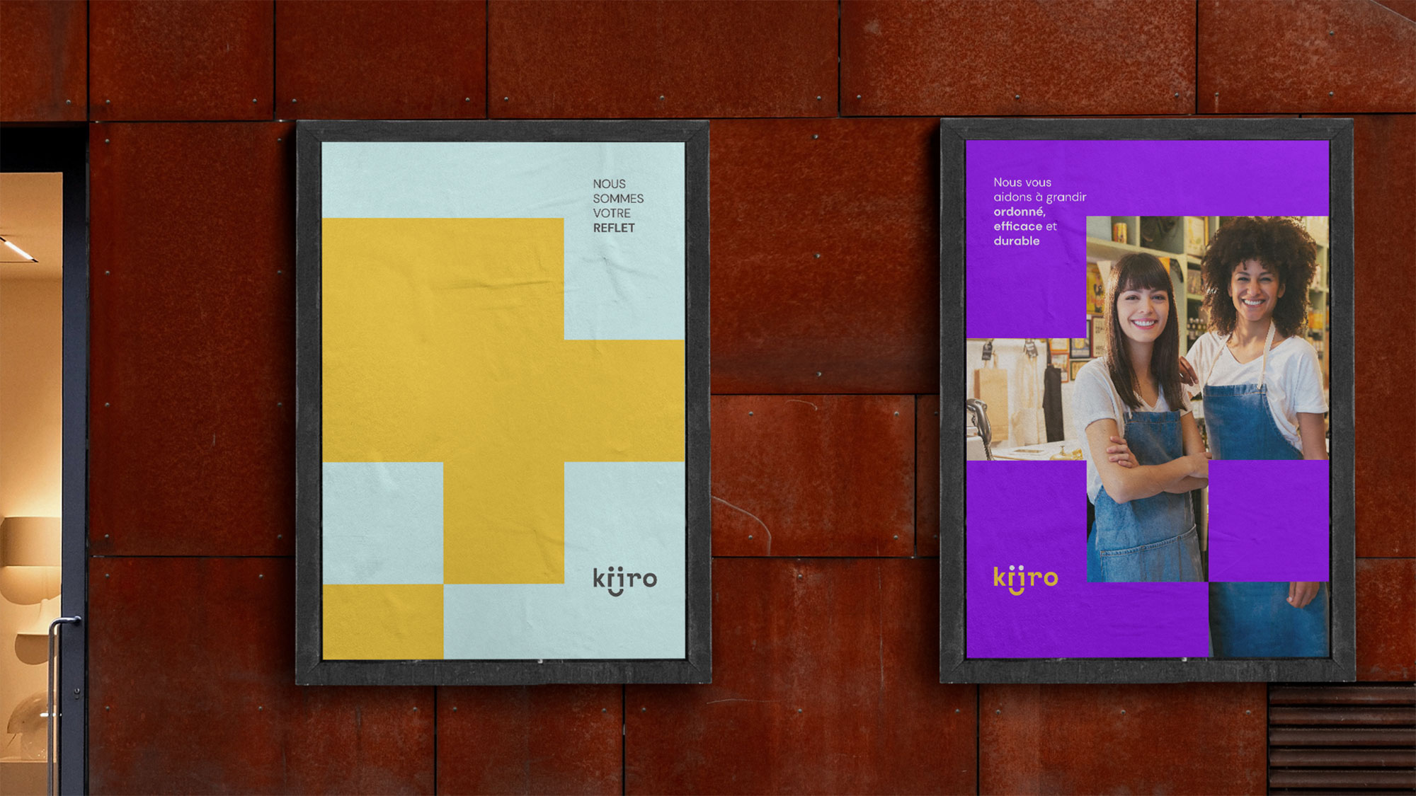
Under the concept «We are the reflection of our client«, we put ourselves in our client’s shoes, becoming their reflection. This way, we understand their most immediate needs, allowing us to grow in a controlled, efficient, and sustainable manner.
In the creation of the logo, we wanted to capture the concept of reflection. With two very simple figures resembling the human form, we illustrate Kiiro’s close relationship with its clients.
On the other hand, since the typography reminds us of classic computer code, as we previously mentioned, we successfully convey the brand’s technological aspect.
Finally, as a nod to AWS and the meaning of kiiro (happiness), we created a smile that also allows us to develop a kind of «mascot,» positioning the brand in a more approachable and client-friendly space.
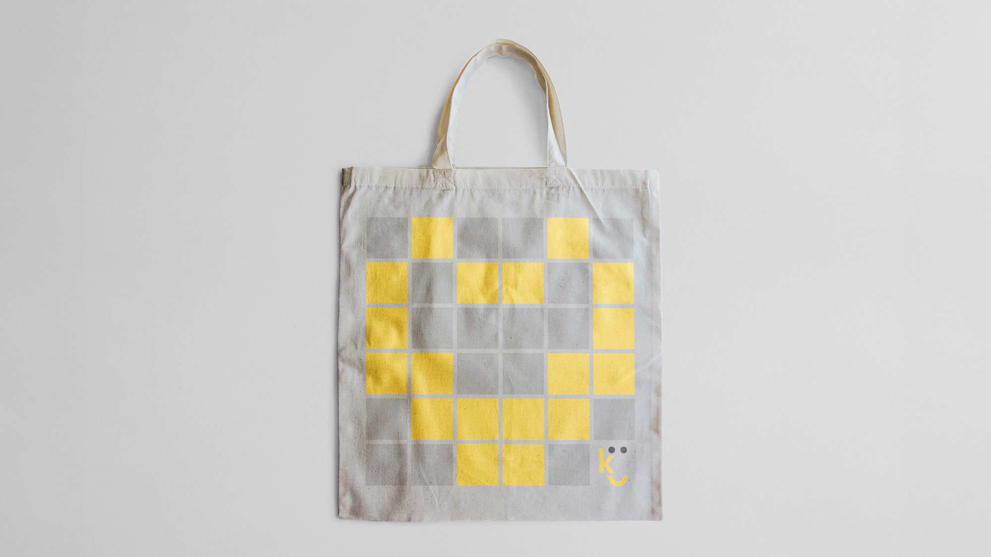
The separation between the two «i» in the logo is formed by a square, representing a bit. This bit serves as the starting point for our base grid, which will always be composed of a minimum of 9 squares (9 bits). From there, depending on the format, the grid expands according to communication needs, conveying a sense of controlled growth.